
Healthy Skin From Within
Gin Amber
Scroll ↓
From High Bounce Rates to High Sales: A UX Case Study on Gin Amber Beauty
Gin Amber, is a natural beauty brand that provides customized skin care through micro-needling. By employing a human-centered design approach, user research, and testing, we addressed the high bounce rates from social media to purchase and created a more intuitive and user-friendly interface. The result was a significant increase in sales conversion and a better overall user experience that aligned with the brand's vision and mission.
“Sales to our site have increased by 60%”
Thank you so much for all the brand strategy and design and for hearing me and understanding what were my needs in when I couldn't understand what tehy were. My brand is doing so well. Since we worked together, our sales increased by 60%. I'm so happy I finally know who my ideal client is. I know how to focus on marketing. I know what to do and where to focus. My website looks incredible. Thank you for all the recommendations. I'm just feeling so fulfilled so happy and so grateful to you.
- Gin Amber
Roles
I assumed the following roles in designing this project:
User Experience (UX)
Customer Experience (CX)
User Interface (UI)
Visual Design
Product Specifications
Duration: 8 weeks
Adobe Suite
Figma
Mural
Keynote
Deliverables
Brand Strategy / Facilitation:
Onsite Brand Workshop
Mission/ Vision / Purpose
User Personas
Brand Attributes
Visual Design
Brand Bible
Style Scapes
Packaging
Marketing Collateral
Visual Identity
UI / UX
Low-fidelity wireframes
High-fidelity mockups and prototypes
Competitive analysis
Client research
Overview
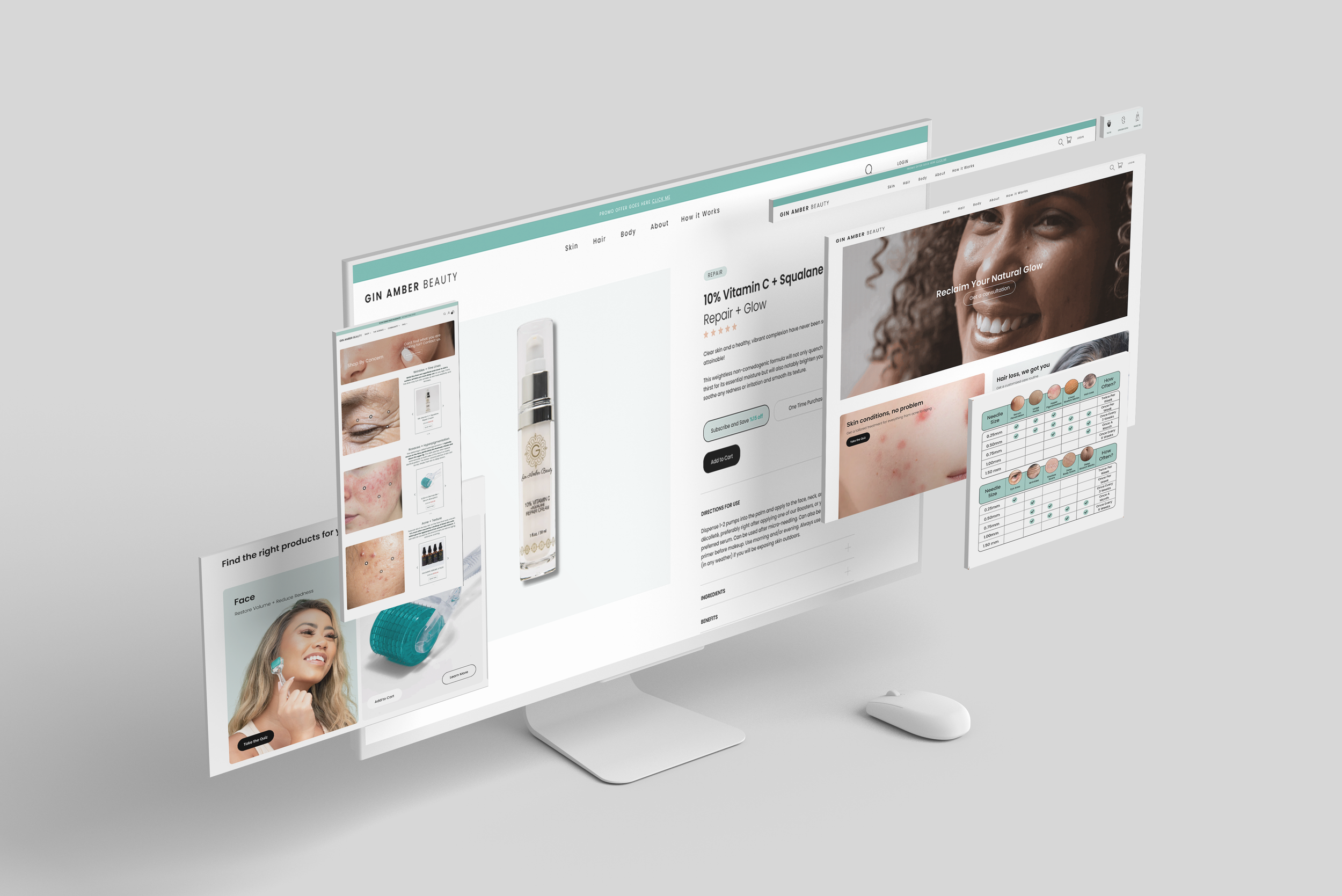
Gin Amber is a natural beauty brand that provides customized skin care through micro-needling. As a UX designer, my goal was to redesign their Shopify site to better meet the needs of the target audience and create a better client experience. Through research, ideation, design, testing, and iteration, I was able to bridge the gap between people's needs and business goals and deliver a successful outcome that aligned with Gin Amber's brand vision and mission.
This case study showcases my UX design skills and problem-solving abilities in redesigning Gin Amber's website and micro-needling tools. By presenting the research, design process, testing, and results of this project, I aim to demonstrate how I employed a human-centered design approach to address the high bounce rates and low conversion on the site. The result was a more intuitive and user-friendly interface that significantly increased sales conversion and provided a better overall user experience for Gin Amber's target audience.

Problem to solve for
While the brand's content was performing well on YouTube, its Shopify site had a high bounce rate and low purchase conversion. As a UX designer, my goal was to identify the reasons behind the high bounce rate and low conversion and to redesign the website to better meet the needs of the target audience and create a better client experience
Proposed Solutions
Conduct in-depth research on target customers and use an empathy map to identify their specific needs.
Simplify the overall navigation and customer journey through easy-to-follow visual prompts and quizzes.
Add personalization features to the site, including a quiz that asks users about their skin type, concerns, and goals to provide personalized product recommendations.
Simplify the site's navigation and checkout process with a clear and concise menu structure, including drop-down menus that provide quick access to key areas of the site.

Research + Key Findings
Fear of Micro-Needling Hinders Conversion
Let’s face it, needles on your face can be terrifying! Our user research revealed that customers were hesitant to try micro-needling due to fear and a lack of understanding about the process. To address this, we needed to provide more guidance and information about the tools and how to use them safely and effectively.
The Power of Personalization: From Confusion to Clarity
We found that customers were overwhelmed by the variety of products available on the site, and needed more guidance to make informed purchase decisions. To address this, we implemented personalization features, such as a quiz that asked about their skin type, concerns, and goals to provide personalized product recommendations.
Emphasizing the Hero Product:
Micro Needling Rool
While Gin Amber offered a range of natural, high-quality skincare products, we found that the hero product - the micro-needling tool - was not being emphasized enough on the site. To address this, we focused more on the micro-needling tool, highlighting its benefits and educating users on how to use it properly. This helped to differentiate Gin Amber from competitors and establish the brand as a leader in the micro-needling niche.
Personas
Through user research, we identified three user personas for the Gin Amber brand: The Beauty DIYer, The Man in the Mirror, and The Middle-Aged Multi-Tasker. Each persona represents a unique set of needs, goals, and pain points that must be considered in designing a user-centered website.
-

Judy Tremblay
AT-HOME SKIN CARE ENTHUSIAST
Meet Judy, after many failed expensive treatments, Jusy is seeks a DIY option that allows her to take control of her skincare routine. She values natural ingredients and wants guidance on how to use micro-needling tools safely and effectively.
”I just don’t even have a clue where to start. Seems like there are so many options out there. I just need help.” -

Richard Hernandaz
MAN IN THE MIRROR
Introducing Richard, after years in the Florida sun, his skin needs some extra love, but he would never step foot into a salon. He is seeking practical and effective skincare solutions without the stigma associated with traditional beauty products. He wants easy-to-use products that don't require a lot of time or effort.
”Looking for something simple I can do at home. Not going to one of those fancy woman spas. That’s not for me. Taking care of skin is something women do.” -

Angela Mitchell
ON-THE-GO BEAUTY BUFF
Meet Angela, she runs an organic farm and keeps up with the schedules of her young family. Angela values convenience and wants a simple at-home solution for her stressed, aging skin. She seeks personalized product recommendations that fit her specific needs and lifestyle.
”I’ve tried everything. Nothing works, I don’t have endless time and money. I barely have any time for myself. I need an easy routine that I can keep up with. “
Defining the Brand Purpose
Through a process of client research and brand exercises, we uncovered Gin Amber's deeper purpose: to empower clients to take control of their skin health through clean, natural solutions and personalized guidance. By emphasizing the importance of natural ingredients and holistic practices, Gin Amber aimed to provide clients with the knowledge and tools they needed to make informed decisions about their skincare needs.


UI/UX
-
Personal Connection
During our research, we also discovered the importance of community and connection in Gin Amber's purpose. The brand was not just about selling products but creating a community of like-minded individuals who shared a passion for natural beauty and wellness. By fostering connections with clients on a personal level, Gin Amber aimed to build long-term relationships based on trust, transparency, and shared values.

-
Guided Care
With this deeper purpose in mind, we developed a design strategy that aligned with Gin Amber's core values and mission. We focused on simplifying the overall navigation and customer journey, adding personalization features such as a quiz to help users find the right products for their unique needs, and highlighting the benefits of the hero product, the micro-needling tool.

-
User Journey
By designing with the brand's purpose in mind, we were able to create a website that not only met the business goals but also resonated with the target audience and supported Gin Amber's mission to empower clients to take control of their own skin health. Our research and exercises on brand purpose helped us to uncover the deeper meaning behind the mission and to develop a design solution that was grounded in the brand's core values.
Visual Identity
After conducting competitor and market research, we recognized that the initial branding was too dark and did not align with the brand's message of inclusivity. We decided to brighten the palette and incorporate skin tones to create a more approachable and inclusive brand identity. By leveraging sleek colors that conveyed luxury, and pairing them with a clean, minimal design, we established a high-end yet approachable brand identity. In addition, we developed a friendly and light-hearted brand voice that conveyed both approachability and expertise, further emphasizing the brand's commitment to personalized and natural skincare solutions.


